Contrast Ratio Math and Related Visual Issues #695
Comments
|
xref #360 (comment) |
Thank you Patrick but as you can see I already posted in that thread. That is a separate and somewhat minor issue. The issue I discuss in THIS thread is specifically about the minimum contrast 1.4.3, and is not minor as it has far-reaching consequences such as a ton of apps that now incorrectly present colors as "accessible" when in fact they are not. And this issue has led to a great deal of misunderstanding regarding color choices and contrast. The thread you linked to deals with a minor error in the relative luminance equation, and while the W3C picked the wrong equation that is not what is causing the much more serious problem that I outline in this separate issue. The issue HERE is using a simple contrast (L1/L2) on linear luminance to define color & luminance contrast. But this does not provide any meaningful value for perceived contrast. I posted this as an issue for discussion while I continue my research (search for an accurate programatic contrast assessment) and pull request separately. |
|
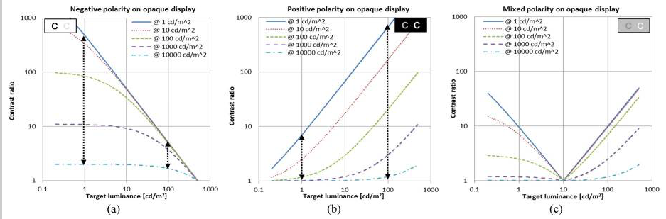
Some additional thoughts regarding 1.4.3 FWIW MY BACKGROUND: I work in the film and television industry in Hollywood as an editor/colorist/VFX & Title Supervisor. I work with color and visual perception issues every day. I am going to continue to post in this thread while I delve further into this before generating a pull request. It is a concern for me because this W3C document is considered authoritative, and has made its way into government regulations. It is important that it be correct, and it is not at present. PLEASE COMMENT if you have thoughts or insights as to why some of these choices were made. Thank you. On Terms: Simple contrast "is not useful for real-world luminances, because of their much higher dynamic range and the logarithmic response characteristics of the human eye."[1] and using simple contrast seems to have led to the higher (4.5:1) contrast specifications: What is the cite and specific justification for the claimed need for a 4.5:1 contrast ratio? Studies by Legge, Rubin, Bangor etc. found that "Contrast by itself had no significance for either vision group." [unimpaired or impaired] [2] However font size and polarity are very important, and contrast does interact with very small font sizes to a degree, especially in negative polarity. The Bangor study indicated that font sizes below 18 px resulted in a need for increased contrast, but these study participants were ether legally blind (20/200) or very impaired (20/100). It is NOT about contrast as much as size and possibly polarity. While it is true that increasing contrast can help legibility for small fonts for visually impaired, increasing the font size offers a better improvement.
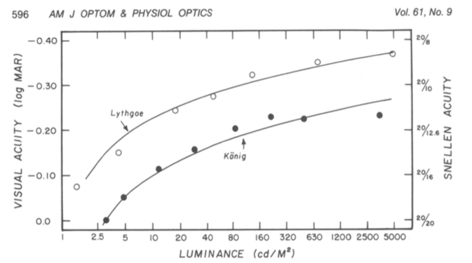
To make this point more clear: The "simple" ratio of #FFF to #808080 is 4.6:1 (3.95:1 if you add in the W3C's 5% bonus luminance). But #808080 to #040404 is a ratio of 178.88:1 (5:19:1 using the 5% extra). #FFF is luminance 100, mid-grey #808080 is 21.59, and #040404 is 0.12 So ignoring the oddly-applied/misapplied "flare" value, white to mid grey is a ratio of 100:21.6 and mid grey to black is a ratio of 21.7:0.12 BUT because the first much smaller ratio is also associated with high luminance it is much easier to read and has much better PERCEPTUAL contrast: 4.6:1 (3.95:1) And the black one with 179:1 contrast (LOL, 5.19:1 with the cheat) I find no justification for the 4.5:1 contrast ratio for 20/40 vision as indicated in the W3's standard. Is it set that way (along with the excessive flare luminance add) to attempt make up for the other deficiencies? See also reference [3] below, a EU paper on this subject. Contrast Sensitivity is a separate measurement from visual acuity. From the referenced Arditi paper: "visual acuity measurements alone are insufficient to characterize basic spatial visual function..." But I don't see where you get multiplying the ISO well established 3:1 standard by 1.5 ?? Looking at acuity vs contrast graphs is see a difference in CS as low as 5% for a 20/40 person. And as I recall the common 3:1 luminance contrast ratio included near normal vision (20/40 is near normal). Here's a graph, (for reference logMAR 0.3 is approximately 20/40.)
In short, it appears to me the 4.5:1 contrast standard is somewhat arbitrary, and there are other more important means to improve accessibility, namely font size, appropriate polarity, and total luminance. LUMINANCE: NITS TO THE RESCUE! (by nits I mean cd/m^2, 1 cd/m^2 is 1 nit ... but maybe I also mean ME, nit-picking on this issue, LOL). The sRGB spec states an 80 nit monitor, however people commonly adjust them to 120 nit to 160 nit, even more (300+ is common. Some phones do 1200). If the monitor is brighter, and the material is black text on white, the light from the monitor results in pupil contraction which improves perceived sharpness. I'll opine that it is more important to have a monitor that is adjusted bright enough for its environment. In fact it would be a good idea to lobby the ISO for an amendment to the sRGB spec to adjust away from 80 cd/m2 to a specific luminance based on the environment. 1996 was a long time ago, and display technology has changed substantially — we shouldn't have to adjust the ROOM lighting to match the monitor, it's easier to adjust the monitor. A standard stating the max display luminance for a given ambient light would go a long way toward real accessibility/accommodation. SUMMARY:The main thing I am lobbying for here is a revised programatic contrast assessment that is perceptually correct. But as I research this, I see there are other concerns that should be considered.
Thank you for reading. I hope to have a solid contrast assessment model this week. Andy Refs: Edited May 22 for typos and some clarity. |


|
Hi @Myndex
|
|
Hi @mraccess77 Thank you for commenting, it helps me to see when I am not explaining or describing completely. But perhaps more important it leads to some new discoveries. In answering your post I did some experiments that add insight. More below. First, just to provide a little more background, I want to mention that I have personal experience with 20/200 vision. Several years ago (in my late 40s) I developed early onset cataracts which brought my vision to worse than 20/200 in one eye, the other diminished a bit less. I now have IOL implants, but those surgeries caused vitreal detachments and retinal detachments, requiring a vitrectomy in one eye, and in the other, continuing issues due to large vitreal floaters that still can interfere with reading. Also, I still need glasses (i.e. it is trivial for me to remove them to introduce poor vision). As such WCAG is a topic I have a close personal interest in. As I mentioned in an above post, I am an imaging professional in Hollywood with a career that spans decades and a background that includes broadcast engineering, colorist, VFX Supervisor, and perhaps most relevant, title designer. I came across this WCAG issue while developing a CSS framework. For the color module I am trying to create a simple color subset that is both easy to read and aesthetically pleasing. This led me down the color and vision theory rabbit hole, where I stumbled on a contrast calculator and saw an odd comment by the coder who mentioned that his "calculate" button did not pass the WCAG standard. The button is completely readable with more than adequate contrast, thus started my present research journey. I have since been doing nothing but research this issue in depth. My posts here are based on that research and my extensive experience in digital imaging.
I cannot agree here. Estimating roughly, 40% of the color pairs the WCAG math calls "PASS" are poor in quality and should fail. And somewhere in the area of 51% of colors they fail could conceivably pass. Wrong nearly half the time is one huge fail. I believe it is the result of incorrect assumptions and cherry picking various bits of standards and cobbling them together into something that is truly inaccurate and unsuitable for the purpose. I'm going to quote Whittle from his paper [1] (emphasis added)
And then from Pelli's paper [2] (emphasis added)
The WCAG ignores this wholesale, despite it being prominent in most research and even noted in the ISO and ANSI standards. WCAG is using simple contrast (Lw/Lk) and that is one of the errors. Among my findings, some of the sites I have the most difficultly reading are "compliant" with the WCAG. There are countless contrast checkers and other automated or semi automated accessibility checkers that use the algorithm as written, and they all fail to detect poor perceptual contrast. And there are a LOT of combinations that pass but are hard to read. An accessibility site has this on one of their pages indicating the problem:
The contrast checkers are all using this flawed model which ignores many important aspects of perception. The results are all over the place and inconsistent. I can see why designers are ignoring the contrast recommendations: they are ambiguous and inconsistent at best. At the moment, visual judgement does a better job than the contrast calculators. I have a page where I am conducting live experiments in this regard, aloing with some commentary on my findings as I go along. This link is: Here are some examples from today's experiments:
Today, I've been looking into luminance — it is well known and researched that increasing luminance improves readability (within a range). One thing the WCAG lacks is a specification on minimum lightness for the lightest element in a color pair.
I have more on this on the page, but as you can see, setting a minimum lightness of the lightest element to #AAA results in a consistent, readable, block of text. On the page you'll see examples where pages with 3:1 contrast and minimum #AAA on the brightest of the pair is more readable than 4.5:1 contrast on darker pairs.
Yes, I am aware, there is definitely correlation to contrast sensitivity due to a number of vision impairments. Indeed, one can have good visual acuity and bad contrast sensitivity. The WCAG does not discuss CS though, and only lists some Snellen numbers like 20/40. I was talking mainly of 20/40, which is what the WCAG talks about regarding AA. For the portion of the standard that relates to profoundly impaired, still the math they provide does not create useful numbers for guidance. And that is the point I am getting at. The math is essentially wrong. Lw/Lk is not well suited for determining contrast in this context. The vast majority of research on contrast sensitivity uses WEBER or MICHELSON or both. Rarely simple contrast. But there are other math mistakes in WCAG related to sRGB and computer displays that also need to be addressed. (EDIT by Andy: May 2019: My recent experiments and research indicates that a "classical, unmodified Weber contrast" is really not "substantially" better than the WCAG math, though there is a modified Weber from Hwang/Peli that is much better than the WCAG math, and other more modern contrast equations such as PCL).
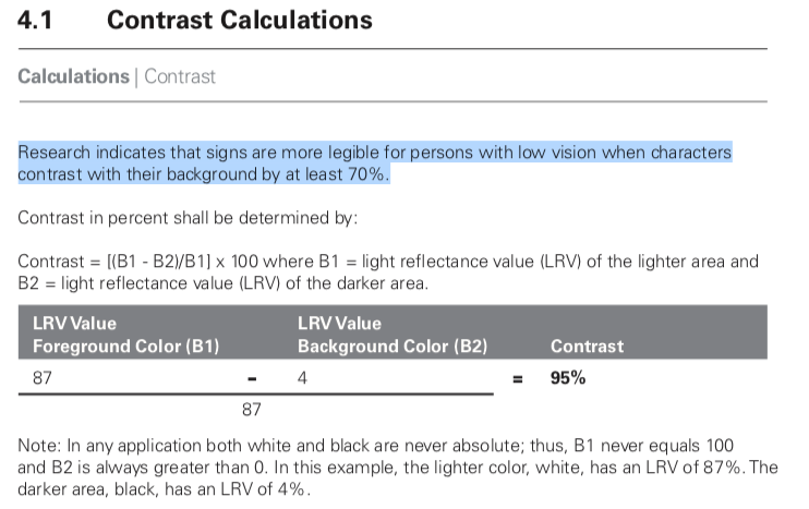
I never said that 4.5:1 is too high, particularly in regards to profound impairment, 4.5:1 is TOO LOW when using the WCAG math. WCAG indicates 7:1 for the more visually impaired (AAA). And yes, the "understanding" text is all over the place and not clear. To be clear, I am not "condemning" the 4.5:1 ratio per se, but I am questioning where it was derived from and the basis of the equations when those equations are not supported by standards nor research. I am also pointing out that luminance is a much bigger factor than contrast yet it is not mentioned, nor is local adaptation unless I missed seeing that. My statements here are from published research as well as my own research. The California Council of the Blind (Lozano, 2009) states, and Federal ADA guidelines also state, that contrast for signs be 70% (note it is a percent not a ratio). The math used for the Federal standard is (B1-B2)/B1 (B1 is the lighter LRV, and B2 is the darker).[3] Now, if I use the WCAG math, 70% equals a ratio somewhere around 2.3:1 to 3.2:1. WCAG math is all over the place and does not relate to Weber's law nor anything else useful. Nevertheless, California Council of the Blind (Lozano, 2009)[4] is on record stating that the Federal equation is flawed when B1 is less than 45. I just came across this a minute ago — I'm slightly amused as it is closely mirroring what I have been saying about the WCAG. I describe this in more detail on the experiments page, and there are more examples. In closing I just want to say that simply switching the equation to Weber is not the complete answer. I think we can do better, and that is the focus of my research. Thank you again for the comments. Andy REFS: Edited May 2019 for some minor clarity fixes. |


|
Hi @Myndex I appreciate your efforts in addressing the shortcomings of the current algorithm. In your examples, I personally found some of the first 4.5 items easier to read than the ones with values greater than #AAA -- thus I know there will always be differences in interpretation by different people as we all see differently. Along those lines with the adaption you were discussing, halos may technically be used to meet the requirement but when you take into account the width of the stroke and surrounding colors haloed text can actually be harder for me to read. I agree that we want more people to use contrasting colors that meet users needs and if we can change the algorithm to meet those needs without lessening it get more adoption that would be a good thing. Personally, I see these changes as something that can't be changed with the current standard as the method is too normative to change with an errata but would be a great opportunity to address for the next version of the accessibility guidelines (silver). It would be good to socialize this with some other folks such as Jared Smith from WebAIM who also would like to change the future direction of the contrast calculations and the Low Vision Accessibility Task Force which is part of the Accessibility Guidelines Working group. Adding @WayneEDick and @allanj-uaag. |
|
Thanks @Myndex for writing this up so thoroughly! |
|
2023 edit for clarification: Weber is not the "gold standard" today, and the link to this post is an inappropriate reference made by Bengfort, as this post was part of the very early due diligence looking into the problems of WCAG 2 contrast failures. (In fact this post was made literally within the first two days of looking into and discussing this problem, four years later the body of knowledge in this area is substantially improved). Weber is not perceptually uniform for the purpose of supra-threshold text on self-illuminated displays. Further, deeper investigation into the origins of the WCAG 2.0 contrast math shows that it is a derivation of Weber, but it is extremely important to point out that the derivation was originally intended only for 7:1, and not intended for lower contrasts such as 3:1 or 4.5:1. At 7:1, the dark color failures of WCAG 2 contrast were not as obvious. Nevertheless the poor results of WCAG2 were used as part of the misguided 1.4.3 SC, despite the objections of major stakeholders including IBM. Original 2019 message continues below: Hi @mraccess77
If that is based on the images in my post above, I should mention that the SIZE of the first set is 30% larger, and therefore easier to read (I just realized the scaling error due to how this site handles images as I looked at the post, post edited to correct).BUT ALSO, three of the first 5 have the brightest color well above #AAA. For an apples to apples comparison, please see the live experiment on the website: https://www.myndex.com/WEB/W3Contrastissue
Indeed, for instance, research shows that most people do better with dark text on a light background (Positive Display) but with my vision, I much prefer light/colored text on a black background (Negative Display). Right now I am having difficulty with THIS site due to the bright background (L* 98 in the text area) yet for most people this is the ideal presentation.
Yes I see it was just tagged as WCAG 2.2 which I was somewhat expecting. Correcting the algorithm also means changing the standard, as far as I can tell the current standard(s) seem to be compensating for the math issues — I don't know the complete history, but that is how it appears based on the reverse engineering/analysis. For an errata, it might be useful to place a note to the effect of: "Current contrast algorithms may overvalue contrasts with pairs of darker colors. Designers should be cautioned not to rely on contrast numbers in these cases/" I should note that problems and controversy on this very subject are visibly present in the research and some standards. It is partly why I am being so proactive here. I hope to cut through the clutter to bring some clarity (puns more or less intended).
Excellent. What are the deadlines for 2.2? As I mentioned in one of my posts while there is much research on simple monitor displays (i.e. black on white, white on black), there is not much in the way of research on complex, graphically rich content (that I've found anyway). I'm thinking some empirical studies would be illustrative. ON ALGORITHMS:
Original post continues: Another idea is using the difference between a brighter/darker L* values (as in CIE L* a* b*). Those are all fairly simple models for contrast determination. A more advanced approach is a true color or image model like CIECAM02 or ICAM. ICAM is the work of Mark Fairchild at Rochester Inst. of Technology. A model like that could (I believe) analyze an overall page, as opposed to a pair of colors in isolation. On the experiments page there is an example of local adaptation issues do to surrounding colors. But here's a quick example:
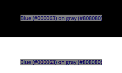
The blue text on grey is WCAG 4.5:1 contrast, and both bits of text are identical. But the one centered on black is more readable because the black allows local adaptation to the darker colors. So among other things, minimum padding for elements against a high contrasting color are important. (I'll mention in passing that pair of blue on grey is a fail in my modified PCL algorithm). And this is where things are more complicated than a simple contrast — web content is graphically rich. Text on a background may be a pass, but if it is far different than the overall page, adaptation will affect perceived legibility. Thank you again, Andy |
Thank you @bruce-usab — I consider this a particularly important issue, partly because W3C standards are used not just for web but for app design and other applications as well. Because it is a freely distributed standard, it has a very wide reach. Myself I spend 12 hours a day in front of monitors, while that may be more than average displays are certainly integral to the lives of so many — we are inseparable from our technology — standards like this have a very real affect on people's lives. This standard in particular has become part of government regulations, for instance. What is the timeline/deadlines for 2.2? I'm hoping to have some candidate contrast models soon, but also thinking there is one giant rabbit hole to crawl down considering how page complexity affects perception (adaptation) etc. Thank you! Andy |
|
There is a mathematical problem with this discussion line. L1 and L2 are
computed using weightings that take color receptivity into account.
R, G, and B have distinct weights in the relative luminance formula.
…On Tue, Apr 16, 2019 at 12:32 PM Myndex ***@***.***> wrote:
Thanks @Myndex <https://github.com/Myndex> for writing this up so
thoroughly!
Thank you @bruce-usab <https://github.com/bruce-usab> — I consider this a
particularly important issue, partly because W3C standards are used not
just for web but for app design and other applications as well. Because it
is a freely distributed standard, it has a very wide reach. Myself I spend
12 hours a day in front of monitors, while that may be more than average
displays are certainly integral to the lives of so many — we are
inseparable from our technology — standards like this have a very real
affect on people's lives. This standard in particular has become part of
government regulations, for instance.
What is the timeline/deadlines for 2.2? I'm hoping to have some candidate
contrast models soon, but also thinking there is one giant rabbit hole to
crawl down considering how page complexity affects perception (adaptation)
etc.
Thank you!
Andy
—
You are receiving this because you were mentioned.
Reply to this email directly, view it on GitHub
<#695 (comment)>, or mute
the thread
<https://github.com/notifications/unsubscribe-auth/AH0OF8FugSGRVmc2nIyMdaxNKnTND_7dks5vhiUzgaJpZM4cui9x>
.
|
Hi @WayneEDick , thank you for commenting. I’m away from the studio, on location, so I can’t comment in depth, but: Yes, luminance is spectrally weighted. However luminance is a linear measure of light. Light is linear (additive) but human vision is NOT linear (essentially a power curve). So while the sRGB coefficients adjust for spectral sensitivity, luminance is NOT relative to PERCEPTION of lightness. L* is perceptual (CIELAB), and gamma encoded transfer curves are somewhat perceptual (such as luma, the Y‘ of Y‘IQ) but not luminance (Y). But that’s not even the most relevant part. L1/L2 is called “simple contrast” and it is wrong in this context. This issue came to my attention when I saw the contrast equation was wrong (as is the sRGB threshold WCAG lists), as I have outlined in my posts above. But now that this is being discussed, we can do better. I am currently investigating PCL and other methods. For further details, I suggest Charles Poynton’s GAMMA FAQ and COLOR FAQ. Here’s a link: https://poynton.ca/GammaFAQ.html -Andy |
|
@Myndex, you asked:
The formal/approved Project Plan has a goal of this time next year for the first public working draft.
I am not optimistic about the chances for wholesale replacement formulas for 2.2. That is possible for 3.0.
Yes. I am one of the actors in helping that happen. There was some user testing associated with the validation of the 2.0 formula. I could not quickly find a cite for that. My recollection is that the hard data pointed to a ratio of 4.65:1 as a defensible break point. The working group was close to rounding that up to 5:1, just to have round numbers. I successfully lobbied for 4.5:1 mostly because (1) the empirical data was not overwhelmingly compelling, and (2) 4.5:1 allowed the option for white and black (simultaneously) on a middle gray. I am sorry to say that I will offline for the next ten days or so, but I will be circling back to this! |
|
@Myndex, this one assertion leapt at me:
That formula was only ever intended for reflective light, not luminescence. It was promulgated in the 1991 ADAAG and was sufficiently problematic that is was dropped in the 2004/2010 ADAAG/ADAAS. Your citation [3] clearly states (more than once) that 70% “is no longer a requirement”. |
|
Hi @Myndex, Just upfront - I strongly suggest we come to a resolution on this issue before you spend time creating a PR.
This doesn't match my testing with people over the years. Not a large scientific study, but 100s of tests (since the early 2000s) with people with low-vision. Whenever there was a color combination that people struggled with it virtually always failed on the contrast level checks. I've also found there are huge differences between people and the particular colors that were an issue for them. E.g. Some participants couldn't see a strong pink on white, which others couldn't ignore as it was so intense. Broadly I think the context that you need to account for is what the guidelines are for, and how they are used. A method to measure contrast for the web content accessibility guidelines needs to:
A lot of the factors you added in the summary above cannot be accounted for in a web standard (e.g. display polarization, nits). Also, at least some of the examples you created have the same 'background bias' effect I mentioned here, perhaps you know the name for that effect? I.e. having a different general background behind the area of interest affects the perceived readability. Reading on, I guess this is the 'local adaptation' issues? In short, I don't think there is such as a thing as a "revised programatic contrast assessment that is perceptually correct", but I'd love to be wrong. A change would need a lot of real-world testing to ensure it provides better results.
Given the scale of change this would require (including the research), I suspect it would be a 3.0/Silver type of thing to do. |
This is the section in reference [3] I was referring to (I did not read the entire document, I was mainly pointing out the continued controversy and unsettled nature of the issue):
Historical and current studies of contrast sensitivity it is typically about 1% to 1.6% over a wide range from 7 or 8 cd/m2 to over 500 cd/m2. NASA also found that under 8 cd/m2, contrast sensitivity fails increasingly. But on the subject of reflected light vs emitted light: both can be measured in luminance. Luminance is proportional to both illuminance and reflectance. And this is one of the HUGE ENORMOUS PROBLEMS facing us in the present conversation, I have seen two COMPLETELY DIFFERENT definitions of LRV. The correct definition of LRV is based on luminance (Y or L) which is linear light, yet some sources state it is based on lightness (L* as in CIELAB, L* a* b*) which is perceptual lightness NOT linear light. YIKES. It appears this stems for the error in the 1991 ADAAG, which from what I have been reading was using Weber on L* and not Luminance? |
Hi @alastc I agree and said as much in one of my posts, it is why I am posting an issue instead of a pull request first.
That's good to know, though I am concerned about the large number of sites I encounter that pass the test yet I find very hard to read. I am less concerned with false fails and more concerned about the false passes in other words.
A "strong" pink on white should have a fairly low luminance contrast, and should fail with proper math though the WCAG math might pass it when it should fail in some cases. The problem with hue is how people with color deficient vision rely on luminance contrast. But also, a light background changes perception of text & contrast vs a dark background. I'm wondering how those who had a hard time with pink on white would have seen the white on pink.
Yes the main issue is adequate luminance contrast. A useful tool for designers might be a tool that captured a website and converted it to greyscale based on luminance so the designer could see the luminance contrast without being influenced by hue.
Cheap or expensive, displays are built to sRGB standards, and often with better brightness. But not the point, as the eye adapts to various conditions of light. What is important is to consider how adaptation affects readability (more on that below).
Most that I am discussing is simple to implement. (It's not harder to use correct math, for instance).
It can — when I talk of polarization, I talk specifically of web DESIGN. light text on a dark background is "negative polarization" (or confusingly, positive contrast) and vice versa. As for nits (cd/m^2) I'm not saying the web standard should specify any particular "absolute" luminance output, but the standard IS already trying to take environment into consideration
Local adaptation, and adaptation in general, need to be part of the design considerations. Dark text on on a grey background may pass via the math, but if the grey background is a div with no padding on a white background, they eye adapts to the white making the dark text on grey hard to read. There is a demonstration of this on the experiments site.
There are definitely better choices than using incorrect math, which is the current state. And while vision and perception are complicated, it is also mostly academic in terms of things like contrast. There is a wealth of research on vision perception and contrast over the last several hundred years that can and should be used to guide this standard. In other words, yes there is such a thing as "programatic contrast assessment that is perceptually correct." It's just a matter of implementing it. There may be added challenges in modern webpages due to the graphically rich content AND the variety of environments due to mobile devices. But the W3C provides the standards and guidelines not just for web design but for browser software. (edited for spelling and some clarity issues) |
|
False fails/passes & ‘incorrect math’: Yes there is lots of research, but any model using Mathematics is a mapping of how light is measured to how it is perceived. There are individual differences in perception, so there cannot be a perfect model (that’s what I meant by ‘no such thing’). Otherwise the pink example wouldn’t vary by person. A different model may improve the fit across a range of visual impairments, but it is not an absolute right/wrong. One model will not fit everyone perfectly, and we should be optimising for people with visual impairments rather than the general population. If there is a better industry standard model to use for measuring contrast, great, let’s test it across a range of people. Secondary notesThere are already tools for greyscaling a screenshot, but we need to be able to assess text (and certain graphics) and show a pass/fail individually. Web content can be defined to use color spaces other than sRGB, but we are planning to standardise testing of contrast to sRGB as a lowest common denominator. |
That makes sense, there are probably some incremental changes that might be helpful as well as "leading a path" to a larger change.
Ah excellent! However, that also means that the standard needs to be solid and unimpeachable. I'd like to help to get to that point.
Hmmm. I'd love to see this data. I believe you that the ratio from the data is higher that other standards as the equation being used overstates the contrast ratio in addition to being perceptually incorrect.
I'm not sure it does, as written the equation is overstating contrast for darker colors. It appears the equation does not take system gamma gain into account, nor the floor of 8 cd/m2 in terms of minimum luminance for contrast (NASA). More discussion to come on these issues. QUESTION: it would be helpful to get online access to certain ISO standards, as well as papers used in the current specification — is that possible? Thank you! |
Just for context though, the formula was already in WCAG 2.0, and that's been out since 2008 https://www.w3.org/TR/WCAG20/ ... so just a word of warning that it's something deeply enshrined and not something that can be changed quickly or easily. It would take a few years at least... |
HI @patrickhlauke, Yes, I do realize this and recognize the issue. I'm certainly not expecting any overnight major change! As I mentioned in one of my posts, I am looking at potential incremental changes that can lead to a more solid solution. At the same time there are a lot of other related standards that use different models and compliance parameters. Nearly all of them are using Weber, but there are newer more useful models emerging. I mentioned some of the reasons I'm motivated for some positive changes here — and to be clear, my intent is to assist in finding easy and workable solutions to the issues I've outlined, and perhaps others. As CSS, Java, HTML develop into greater feature sets, I've noticed a disturbing trend toward sites that are "fancy but less useable." So much so that many browsers now have the reader view to turn off all the crap!!! |
|
Here are my questions.
When you use the term spectral in the sense of functional analysis?
While gamma is not a linear function it is differentiable and can be
represented piecewise by line segments without? Are you saying the W3C
representation does not use enough line segments in it's approximations? Or
are you saying that gamma does not come into the equation?
Finally what is your formula precisely including visual factors.
I would like to analyze this. I am a mathematician.
Sincerely, Wayne Dick PhD.
…On Fri, Apr 19, 2019 at 3:41 PM Myndex ***@***.***> wrote:
Just for context though, the formula was already in WCAG 2.0, and that's
been out since 2008 https://www.w3.org/TR/WCAG20/ ... so just a word of
warning that it's something deeply enshrined and not something that can be
changed quickly or easily. It would take a few years at least...
HI @patrickhlauke <https://github.com/patrickhlauke>, Yes, I do realize
this and recognize the issue. I'm certainly not expecting any overnight
major change! As I mentioned in one of my posts, I am looking at potential
incremental changes that can lead to a more solid solution.
At the same time there are a lot of other related standards that use
different models and compliance parameters. Nearly all of them are using
Weber, but there are newer more useful models emerging.
I mentioned some of the reasons I'm motivated for some positive changes
here — and to be clear, my intent is to assist in finding easy and workable
solutions to the issues I've outlined, and perhaps others.
As CSS, Java, HTML develop into greater feature sets, I've noticed a
disturbing trend toward sites that are "fancy but less useable." So much so
that many browsers now have the reader view to turn off all the crap!!!
—
You are receiving this because you were mentioned.
Reply to this email directly, view it on GitHub
<#695 (comment)>, or mute
the thread
<https://github.com/notifications/unsubscribe-auth/AB6Q4F4R2KE2T7DNR7IJLFLPRJDDJANCNFSM4HF2F5YQ>
.
|
Pink/white relates to hue contrasts. The more perfect accepted model is luminance contrast as it's connected to contrast sensitivity. CS threshold is 1%-1.6% over the wide range of 8 cd/m2 to over 500 cd/m2, as shown in study after study, including many visual impairments. There are of course some impairments that directly affect CS/CSF, but contrast sensitivity is separate from visual acuity. Visual acuity is helped more by size than contrast. perceived contrast is more complex than a ratio between two colors as it is substantially affected by adaptation, local adaptation, chromatic aberation, and other issues. CHROMATIC ABERRATION: So this relates to an optical issue with any lens system, including human eyes. Light at different wavelengths are "bent" differently through a prism, which is why a prism creates a "rainbow". Lenses are a form of prism, and blue light through a lens lands in a different spot than red light as a result. (It is theorized that this is why our eye evolved to have red cones in the center and blue cones on the periphery). But this is a reason that red (#F00) and blue (#00F) look wacky together - the shared red/blue edge focus to different places on the retina. The hot pink you mention is #FF00FF - so red and blue with no green, the red portion of the text edge focusing differently than the blue edge. So for instance, working with colors that have a high blue content needs care, as NASA discusses: https://colorusage.arc.nasa.gov/blue_2.php That NASA site covers a lot of related material, and it is all about user interface design considering adverse viewing circumstances.
The "standard' has been Weber the 1800s. There are better models now, and particularly as web pages are a "unique environment" in that they are displayed using certain standards, there are definitely better ways to assess perceptual contrast.
Okay, but as I have demonstrated and discussed, the ratio of two colors by themselves in isolation will not give you a complete answer.
Hmmm, no you can't. The standard is still sRGB. the CSS 4 working draft does list additional working color spaces as something desired for future implementation, but that's a pretty horrible idea at today's level of technology. sRGB is ideal for 8 bit. Any larger colorspace and you start needing at least 10 bit pretty quick. I see talk of linear_sRGB or linear_Rec2020 - then you need at least 16bit_HALF(FLOAT). Double bit depth and you double data size, and pages are ALREADY overbloated and slow. And you'll NEVER see the benefits under typical ambient conditions and cheap devices. To wit: bigger color spaces do absolutely ZERO to assist impaired vision, There is ZERO luminance contrast difference (and it's worse if you stay in 8 bit: A super-big space like ProPhoto is GARBAGE on 8 bit, and will provide WORSE contrast gradation (i.e. causes banding) due to the ginormous delta E errors. NOT TO MENTION the fact that ProPhoto uses IMAGINARY primaries, meaning that values like #00FFFF DO NOT EXIST in ProPhoto as something you can see. Most mobile browsers and many desktop browsers still do not support any form of color management. sRGB is the standard, and is expected remain that way for the foreseeable future. The CSS tag for alternate colorspaces is not. FOR ACCESSIBLE: 8 bit and sRGB (and Rec709) is the ideal standard at present technology. Yes, there are some emerging color spaces like Rec2020 that are bound to make a difference someday but all these alternate color spaces have different transfer curves and different primary coordinates. Converting between spaces is computationally expensive, which is why most mobile browsers are NOT color managed and instead are sRGB "compliant". I have high end $$$ wide gamut monitors (which are probably what caused my early cataracts), but those are rare — sRGB/Rec709 define nearly all distributed content be it Web or Broadcast worldwide, and in a non-color managed way. If you use monitors OTHER THAN sRGB/Rec709, then you MUST have color management to transform colorspaces, and that is computationally expensive. I discuss some of this in some articles I've written over the years reprinted here: https://www.generaltitles.com/helpfiles/13-q-a-blog/colorspaces-and-file-types Thank you for the comments! Andy |
Hi @WayneEDick ! This is part of the CIE 1931 standard on luminance, the Y in CIEXYZ. The standard is spectrally weighted relative to the LMS cones (red green blue cones) that make up human trichromatic vision. The coefficients 0.2126, 0.7152, and 0.0722 are part of the Rec709 standard for HDTV, and sRGB is derived from that standard. Both Rec709 and sRGB use the same color primaries and white point — the only practical difference is the transfer curve (effective gamma) is a little different between sRGB and Rec709, the reason being that Rec709 gamma is relative to a dark living room and sRGB is relative to a brighter office type setting. Charles Poynton's Gamma FAQ is really the best crash course on this.[1]
Gamma is one form of a "transfer curve" to transform a particular color value from one colorspace to another. It is often represented "piecewise by line segments" as what we call a LUT (look up table). LUTs are very common in the film/television industry because the color represented in negative film is sufficiently complicated that it can't be accurately represented with a simple equation or matrix. 3D LUTs are used to create accurate transforms through various color spaces in the post production process. Some color spaces like Adobe98, use a pure exponential transfer curve. BUT ALSO: the sRGB and Rec709 transfer curves in their "correct" implementation use a combination of an exponential curve attaches the a linear region near black. The linear region has a number of purposes and motivations, including reducing camera noise near black and math issues with pure exponential curves near black.
It uses "none" because luminance is linear, as in a straight line. Luminance has no gamma (or technically, the gamma is 1.0). Luminance is proportional to light, and light in the real world is linear. The human eye is NOT linear, photopic vision has a gamma of around 2.4 to 2.5 (though vision is more complicated due to adaptation, scoptic (rod/dark night) vision, etc.) This is the CIE L* curveL* is based on human perception. Luminance (not shown) would just be a straight diagonal line from 0,0 to 100,100.
Right now human perceptual contrast is not represented in the WCAG "Understanding 1.4.3." Luminance is derived by first applying the reverse transfer curve to each of the R´G´B´components, then multiplying them by the coefficients, and then summing them for the total luminance (Y but sometimes shown as L but NOT to be confused with L*). THEN they use a simple contrast ratio Yhi/Ylo or as they print it L1/L2. They also add 0.05 flare to each term. ((L1 + 0.05)/(L2 + 0.05)). So here is the point I was getting at: the use of L1/L2 is only useful for very absolute black & white values, because it ignores a lot of what happens with perception of in-between values. The "standard" math for contrast of TEXT is WEBER CONTRAST which uses the Weber fraction, which is ΔL/L — Weber has been around for a very long time, and most contrast standards and research are based on Weber or Michelson, not simple contrast. Simple contrast is used for example for the contrast of a monitor from maximum black to maximum white, but not for the in between values. EDIT: Weber contrast is often stated as (Ybg-Ystim)/Ybg, but this can result in odd results. For monitors/displays, try (Ylightest- Ydarkest) / Ylightest I am NOT saying that Weber is the ultimate solution, but it is what jumped out at me when I was investigating why web contrast calculators were presenting "weird" numbers relative to legibility. This led me on this path of "how did we end up here" which has now morphed into "what is the most useful modern perceptual contrast calculation." Other notes on WCAG math: The sRGB conversion to luminance is using some incorrect values. The problem is minor and likely has little effect on the contrast issue, but I will show to the correct sRGB formula below. Also, just FYI the coefficients must be applied only after the gamma is removed, but there is an interesting wrinkle here: even the "correct" luminance math does not account for system gamma gain. There is an additional 1.1 or 1.2 exponent applied to the signal by the monitor/display. This is common even in older systems like NTSC, which used a 1/2.2 exponent at the camera, but the CRT display was actually ~ 2.5 resulting in a system gamma gain at final display. Final display gamma can in fact be adjusted by the user with the monitor controls (that adds the uncertainty aspect to all of this). But I did notice that when I added a 1.2 exponent to the resultant luminance, it improved the perceptual uniformity of the resultant reported contrast (at least it seemed to, I have not run a real controlled study yet).
I suggest looking at Weber contrast, Michelson contrast (aka modulation), but also two modern methods that I am investigating and experimenting with, Bartleson-Breneman Perceptual Contrast Length[2], and one I just recently found that apparently is the basis for the Australian accessibility standards, the Bowman-Sapolinski Equation [3], though I;m not certain it can be used on CIE Y (Luminance). And then there are methods using L* (perceptual lightness from CIE L* a* b*) instead of luminance, in that case, it's not usually a ratio, but a difference (L*1background - L*2 foreground) as L* is perceptually uniform. So for normalized values of 0 is min and 100 is max: Y (luminance) 0 = L* 0 = sRGB 0 and Y 100 = L* 100 = sRGB 100 This is because the perceptual halfway point between black and white is not a luminance of 50, but a luminance of 18.4 but on the perceptually uniform L* curve, the halfway point is 50. On sRGB its about 46.7 because as I mentioned earlier, sRGB has additional system gamma gain. Adding an expoinent of 1.102 to Y will put Y 18.4 at sRGB 50 for example (and I'm not saying that necessarily "should" be done, just that's how the math is for comparison).
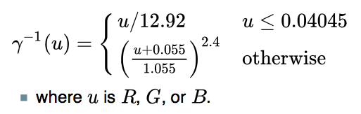
That is REALLY awesome to hear, I was hoping a mathematician would get involved. I have some planned experiments this weekend, I'll post more as I progress. Note: the correct luminance calculation for sRGB -> D65 Y is: From 8 bit R´G´B´, divide each channel R´G´B´/ 255 to get them 0-1, then R * 0.2126 + G * 0.7152 + B * 0.0722 = Y (D65 luminance) For your cut and paste convenience, here is the gamma-to-linear portion from my OO spreadsheet: =IF( R1 <= 0.04045 ; R1/12.92 ; POWER(((R1 + 0.055)/1.055) ; 2.4) ) ALSO if you are looking at other color transforms, we are only concerned with D65. Some CIEXYZ and L* a* b* transforms use a D50 whitepoint, which should not be a part of anything we are doing with monitor contrast, it's D65 only. [1]https://poynton.ca/Poynton-color.html |

MORE USEFUL CONTRAST MATHSo today I came across this recent research at NIH (just a couple years ago) that directly states what I have been attempting to explain in the above posts. While they don't mention the WCAG, they do use the WCAG simple contrast ratio (CR) equation as a comparison to their modified Weber equation, including the WCAG's 5% ambient component. The paper states specifically (emphasis added):
NIH PAPER: https://www.ncbi.nlm.nih.gov/pmc/articles/PMC5489230/ They do modify Weber a little differently than I have, and their results are interesting and provide a further demonstration of the problems with "simple contrast" (CR). There are a couple small caveats I'll discuss after the summary. The paper is a short read, but here's a synopsis: The WCAG contrast ratio (CR) is (Llight + 0.05)/(Ldark + 0.05) The modified Weber is: (Llight - Ldark ) / (Llight + 0.05) Hwang-Peli Modified Weber for Realistic Contrast for MonitorsCS Log plots of contrast versus ambient light:
Modified Weber log plots of contrast versus ambient light. Note that Weber is not a ratio, but a value ov 0 to 1 (which can be *100 and described as a percentage, like Michelson):
Some thoughts:
For the purposes OF THIS DISCUSSION THREAD, I want to offer these (hopefully more clear) terms based on acronyms: WOB: for white on black, any light text on any darker background. And maybe: WOG and BOG, where the background is near a middle grey value.
Next Post: Path Forward. |

PATH FORWARDBased on all the research and discussion THUS FAR, I see the following general path forward as far as changes and pull requests for the WCAG: WCAG 2.2 (and possible errata for 2.1/2.0)
WCAG 3.0
THREADS: Should we create a new thread for 3.0, and then set the discussion here just to the incremental changes I've proposed for 2.2? Thank you all again for all comments and thoughts. Andy |
APCA npm PackageOne end result of this thread has been the creation of the Advanced Perceptual Contrast Algorithm for WCAG_3 (silver). While research continues, the public beta APCA npm package is now available: apca-w3 Install:Usage:And the API is trivially simple: send it two colors, it returns a signed INT of the Lc value (lightness contrast). Implementation notes:Color sent to the required parsing function For questions and comments please visit the main APCA repo discussion area. Thank you! Andy |
Three Year AnniversaryToday is the three year anniversary of this thread, and of the research project into developing the technologies to improve readability on self-illuminated monitors and mobile devices.
Thread TL;DRHere are the highlights & overview:
Status of the workThis work became a very deep dive into the user needs for readability of text and discernibility of non-text on self illuminated displays. It has been a combination of scientific research and investigation here in our lab in Hollywood, and with the guidance and oversight of members of the AGWG in the Visual Contrast Subgroup where the practical application in terms of a reasonable guideline was formed for the future Silver/WCAG 3 guidelines. APCA: Accessible Perceptual Contrast AlgorithmThe key technology that resulted from the work is the APCA, an algorithm for predicting human perception of contrast on self-illuminated monitors and devices. APCA is rooted in decades of existing color appearance model technologies, including but not limited to CIELUV, CIELAB, CIECAM02, The Hunt model (Kodak), R-Lab (M. Fairchild, RIT), P.Barten work on contrast modeling, the work of M.Stone (PARC,NIST), and of L. Ahrens (NASA). The models mentioned above are general in purpose, and often extremely complicated, being utilized on tasks such as image data compression. For APCA we worked to create a model as simple as possible and tuned specifically to the user needs of readability on displays and mobile devices. Candidate WCAG 3 guidelinesBy itself, a mathematical model of human contrast perception would lack utility without a set of guidelines on how to use the results of the predictions in terms of design choices. The candidate guidelines for WCAG 3 are based on the well established readability research of Bailey/Lovie-Kitchin, G. Legge, A. Arditi. and were developed in the Visual Contrast Subgroup of the AGWG/Silver project and that continues in the Low Vision Task Force, we have ongoing studies validating these guidelines. APCA and the APCA guidelines promote a substantial improvement in readability and accessibility for sighted users of content on displays and devices, especially compared to those of the old WCAG 2 contrast SCs. APCA and the APCA guidelines provide:
Bridge PCAA concern (voiced by a small minority) relates to conformance for WCAG 2 contrast SCs where they may be dictated by law ro regulation. While in the majority of cases, when APCA guidelines are followed correctly, the result is superior accessibility compared to 14.3 and 1.4.11, among others. In particular as WCAG 2 contrast math provides an unacceptable number of false passes as it is not correct relative to human perception nor impairments. One of the side effects of the WCAG 2 contrast math inaccuracy is that it also fails color pairs that should reasonably pass. APCA may correctly pass a color pair in this situation, and the concern was raised regarding strict compliance. To be clear, this is a very narrow interpretation of the laws, and is applicable to a narrow set of use cases, if at all. Nevertheless, to provide a bridge method for those holding this concern, to develop something backwards compatible to WCAG 2, and also forwards comptible for WCAG 3, Bridge PCA was born. Bridge PCA is using APCA technology, but has the following features:
The Paper Reading Experience and MoreThe scope of the research into readability has expanded, and a number of exciting things ahead as the work progresses. One is a set of guidelines to "The Paper Reading Experience" aimed to create highly readable content with minimal fatigue. But also, the APCA was designed to be both adjustible, and extendable, to be able to flexibly address new technologies, such WGD and HDR. At present, APCA is setup to accommodate sRGB, Display-P3, and AdobeRGB. It is fairly straightforward to create an input module to address any display color space. TOOLS
APCA Demo ToolThe canonical demo tool for APCA is at http://www.myndex.com/APCA/ this tool takes a pair of colors, and provides a recommended minimum font size and weight along with the contrast results. This tool was just updated this week for the three year anniversy, with a new look, and new features! Bridge PCA Demo ToolThe Bridge PCA tool is at http://www.myndex.com/BPCA/ this tool takes a pair of colors, and returns a WCAG 2 style ratio, which is intended for use with WCAG 2 SCs, and is a drop-in, backwards compatible replacement for the old WCAG 2 math. This tool also freshly updated this week, with a better "transition to APCA" method, and of course, is still bakwards compatible with WCAG 2 math. Third Party ToolsThere is a growing list of third party contrast tools using APCA technology, and you can see them at Myndex/SAPC-APCA#51 — and if you have a tool you are developing, please list it here! Color Vision Deficiency SimulatorThe Myndex CVD sim is at https://www.myndex.com/CVD/ and provides clinically accurate simulation (Brettel model) of various forms of color insensitive vision (inaccurately called "colorblind"). Here you can process a screenshot of your content to see how it is perceived by color insensitive vision.
RESOURCES — Third Party Review/DiscussionIndependent, third party criticism of WCAG 2 contrast.The inherent problems with the WCAG 2 contrast math have been known for some time and widely critisized. Including studies by others showing that color insensitive types are not well served. The WCAG 2 contrast specs often cause enough problems for designers that it is ignored. Independent, third party reviews of APCA.Several independent reviews that include demonstrations of APCA as a significant improvement over WCAG 2.
RESOURCES — APCA EducationWhy APCAA plain language article explaining the need to replace WCAG 2 contrast math, and the benefits of APCA. APCA in a NutshellA plain language synopsis of the APCA Draft White Paper on APCADiscusses the underlying methods of the technology, with bibliography. Let's Flip for Color!If you want your text to be either black or white if the user selects some random color, just where is that inflection point? Additional articles and discussions:
EXAMPLESWCAG 2 does not calculate appropriate contrast values for "dark mode".
WCAG 2 does not provide consistent contrast results over the visual range,
RESOURCES — Code and Repositories
NPM ReleasesThe key releases are available as npm packages: APCA W3:Bridge PCA:Color Parsley:
SPECIAL THANKSFor their direct and constructive help, guidance, and continued support, and without whom this project would not have developed as successfully as it has, I want to thank: Visual Contrast Subgroup members, and AGWG chairs, without whom this project would not have been possible:Bruce Bailey @bruce-usab Members of the Accessibility, Design, & Development communities (in no particular order) your feedback, discussions, and support have been invaluable:Charles Hall And the Research and Writings of these noted visual perception professionals, whose work provided the foundation for APCA, SAPC, SARCAM and the other developments we are working on:Mark Fairchild (RIT) In ClosingWhen I think back to the start of this project, I was thinking a solution could be had in about three months. LOL!!! While there was a basic solution in three months, it became clear that this is an under-researched area, and the rabbit hole was not only deep but endlessly fascinating. Today, we have a variety of solutions including a drop-in replacement for WCAG 2 math to "bridge the gap" toward a more readable future. Hopefully this provides a good overview/resource for all things related to APCA and readability contrast. To be even more concise, here's a link-tree of the most important links: https://linktr.ee/MyndexThank you all, Andy Andrew Somers APCA • THE REVOLUTION WILL BE READABLE |


APCA QUICKSTARTThe thread above is pretty massive — 127+ comments and 44,000 words. And elsewhere there are many other threads, articles, white papers, documentation... All told, this project has spawned a mass of material, making understanding challenging. It's a lot to weed through to fine the important material. This is a case where "less is probably more." So in the interest of making this learning curve as short as possible, I've created a brief plain language overview, and organized a link catalog of further resources. Get ShortyThis is a short introduction to the importance of perceptually uniform contrast for readability, simply titled: "Why APCA". Tool TimeThis is the simple demo tool of the technology. On this page there are also a few "twists" with additional documentation, including how to use it and other design guidance. The URL is easy to remember: APCAcontrast.com A Brief History of ContrastFor those wanting the deeper dive, this is a curated page of resources relating to color and contrast. It includes third party and peer reviews of APCA, supporting articles, documentation, and more tools, code and other resources, all organized in sections. git.myndex.com Thank You For Reading! |
|
The following peer-reviewed article published by Smashing Magazine provides a good overview of the essential concepts involved in visual readability and accessibility: |
|
I regret missing the GitHub ping back in January. @Myndex, great article! |
|
Hi @bruce-usab Thank you very much! |
|
Consider the APCA values for this VGA-like palette: |

|
Hi Jan @jengelh Let's Go Clamping
No, that is not the cause for zero. In the case of APCA, the guideline version is clamped to zero for contrasts that are less than about Lc ±8. This is intentional and by design, for a number of reasons. Among other things, APCA and the APC-Readability Criterion sets a lower limit for non-specific non text at Lc ±15, and Ancillary text at Lc ±30, so as far as guidelines are concerned, the very low values are not useful. Zero to do...This has nothing to do with perceptual lightness contrast. There are APCA versions that are full range. And APCA full range and SACAM are certainly capable of discriminating small contrasts. The full range APCA is perceptually uniform over the entire visual range all the way down to invisibility, if that's what you are asking. Using the SAPC research tool for your examples, . . . . . . . . . . . .

EDIT NOTE: I misinterpreted the artifacts in the image, which I discuss in a later post, below. Apology to Jan @jengelh for the confusion. Also, APCA is tuned for a range of text sizes, and it is incorrect to demonstrate APCA with a single size and weight. Small thin fonts and thin lines need high contrast, and big thick elements work with lower contrasts. Lower contrasts should be demonstrated with larger/bolder fonts. HK Effect and ContrastsNext, it's important to recognize the Helmholtz-Kohlrausch effect, where certain highly saturated colors appear brighter than their measured luminance would imply. However, when it comes to reading and web content, which is specifically what APCA was developed for, color contrast is not per se useful. Luminance is what gets to the visual word form area and lexical processing. Chroma/hue contrasts are not particularly useful for readability. Take a look here, the top three are very high color/hue contrasts, but nearly zero luminance contrast. The last one is decent luminance contrast, but nearly no hue contrast (some saturation contrast though). 
Guess Hue
APCA does not ignore hue. Yes, it is a lightness contrast predictor, but hue is accounted for the degree needed for readability. Moreover, luminance, i.e. Lightness Contrast, is needed by ALL vision types, not just those with color vision deficiencies (aka colorblind). Later this year we will be releasing some enhanced features for CVD and protanopia, to help more with wide gamut displays, but that module is about compensating for the loss in luminance for certain CVD types when red is paired with dark or black. Color At WarHering's opponent process describes how the early stages of the human vision system works: the LMS cones (stimulated by RGB) get matrixed into a red/green channel & a yellow/blue channel (chroma/hue), and a light/dark channel (luminance). The visual cortex processes luminance separately from chroma/hue. Luminance carries all the fine detail, and is three times higher in resolution than chroma/hue. This is why we can literally throw away most of the color information for compressed image encodings like JPEG. So if we are talking about contrast for readability, it is the luminance aspect that is critical, and this goes for all sighted users. I hope that answers your questions, feel free to follow up here or at the APCA forum. Thank you for reading, Andrew Somers |
|
While clamping is the correct explanation for those zeros (and I was under the impression taking the hue into account was a huge part of the motivation for APCA in the first place), the mention of “dark outlines” is very surprising! |
|
Hi @mwgamera and thank you VERY much for that comment.
Well, the outlines do exist... when viewed in a browser on MacOS with a retina display. 😳 DOH!I recently updated to the latest Safari, not sure when this changed, and it may be more related to my recent OS and Safari upgrade, on the retina Macbook. I had opened the image into its own tab in Safari, and zoomed into that window—at some point in the past, viewing the image by opening it to its own window would have discarded the filtered image processing, essentially displaying the image as if with the CSS tag: img {
image-rendering: crisp-edges;
}Apparently opening an image into its own browser window no longer does that. Ooopps. Viewing in Preview or an image editor display the original png correctly. I downloaded the png and indeed it is as: 
But when scaling up in Safari, it the image is re-processed. I would have expected that if Safari or the OS was processing it for a given size, it would look more like: 
The image I saw, which I posted previously, looked much cleaner, not like a scaled up filtered image, and more like something with intentional outlines on.
Good guess, but it is definitely due to reprocessing, I dug into the issue a bit more: Digging DeeperSpending a little more time so as not to make such a mistake in the future, I looked into this a bit more. Apparently, for Macs with retina displays, at least on certain newer MacOSes, some web images are processed in this way when upscaled for the retina resolution. Yuk. Herein lies the caveat that "automated one size fits all" convenience features are not without issues. Clearly an image with hard edged graphics like this should not be filtered/processed for "smoothing". Regarding Resizing
This is not per se relevant to the present issue. The issue is that the Retina display/Safari on MacOS results in some automated processing of some images, where the resampling exhibits this ringing. But there's more: CLICK to expand discussion on spaces and resizing, etc.INDEXED COLOR ISSUE A possible contributing factor is the OP's image is indexed png. In Gimp, trying to scale while still in indexed mode, regardless of the method (linear, cubic, NoHalo, LoHalo), all exhibited this edge ringing. Gimp's "none" I assume is nearest neighbors, and as you pointed out worked for purpose. That said, if the image is converted to a regular sRGB image, then the various interpolations worked fine, even in sRGB gamma encoded space. Indexed color, 200% using Cubic
sRGB color, 200% using Cubic
Linear RGB (gamma 1.0), 200% using Cubic
DiscussionIn this case, there doesn't appear to be a benefit to converting to linear 32bit floating point (gamma 1.0), and using the cubic scale algorithm in Gimp, the results seem identical. But the results are notably bad (as expected) for indexed color.
Linear (gamma 1.0) RGB spaces are often preferred for blurs, compositing, and may be helpful for scaling and other transforms, depending on the image content. A perceptually uniform space is not going to be specifically better than sRGB for these specific tasks. The reason linear can be better for some tasks is that it makes the math simple, and works very much like real light in the real world: if you have 100 photons of light and you double it, you then have 200 photons. In a linear space, applying a blur works more like a lens being out of focus. And merging two images together using "Additive" can have very naturalistic effect. Perceptually uniform spaces are the opposite of simple, and use spubstantially more complicated maths. But they are useful for creating gradients, picking colors, and converting to a different color model (i.e. going RGB to CMYK). sRGB does not follow the linear transfer curve, and neither does a perceptually uniform space, as perception is also not linear. But in terms of transfer curve, sRGB is much closer to a perceptually uniform space than it is to linear. While sRGB is not technically "perceptually uniform", the TRC (gamma) is "close" to perception. The use of gamma is not just a hold-over from old CRT based displays. Now that we no longer use CRTs, gamma encoding is still useful because it does follow human perception to a degree, allowing more efficient utilization of the available data space. . . . . . . . In short, linear space and sRGB are as different from each other as linear space is from a perceptually uniform space. Different spaces for different purposes—If something is specifically beneficial in one, that typically excludes the other. A bit more on APCA
No, the reason I started this thread back in 2019, and did the subsequent work on developing APCA and related methods and guidelines was to address the well known problems with WCAG 2 contrast guidelines. As for hue, that is part of it, see "What’s Red & Black & Not Read All Over?" CLICK to expand discussion of APCA & WCAG2APCA does take hues more correctly into account as an aspect of perceptual uniformity—but the main objective of APCA is to improve readability, by accurately predicting luminance/lightness contrasts across the visual range. The biggest major problem with WCAG 2.x is the WCAG contrast math is not fit for purpose, it does not follow nor predict visual perception of text, does not solve the problems it claims to, and overall casts a shadow on the rest of the WCAG accessibility guidelines. One of the things WCAG 2 does not do, that it claims to, is help those with color vision deficiency. WCAG 2 contrast math greatly overstates the contrast of dark colors, and understates the contrast of lighter colors. As a result, it allows red & black as a pair, but rejects red & white as a pair. This is the opposite of what protanopia needs for instance. But in fact, WCAG 2 contrast fails for all users, various studies show that 47% of the color pairs it passes should reasonably have ben rejected. This precludes its use for any kind of automated color tools. The current public APCA and APC-Readability Criteria mitigates this in the algorithm. And this summer we are releasing the protan extension which will ensure accommodating for UHD/Rec2020, which uses a very inaccessible red primary. APCA is perceptually uniform across the range for self-illuminated displays and text, the most critical target. This enables the use of automated color tools such as the CSS . . . . . . .
In order to remain simple, the current public APCA calculator calculates only a pair of colors. Sharpness and blurriness are mentioned tangentially in the guideline regarding font smoothing. CLICK to expand discussion of APCA multi-way & guidelinesThat said, there is a multi-way calculator, it is not public. We am not making the advanced methods public as they add much complication to the guidelines, and there has already been some demands that public guidelines remain "simple". So, we'd say the actual specific guidelines for testing/evaluating outlines and shadows is under development, but due to the increasing complexity, the more complete calculations will probably reside in design systems rather than public guidelines. The real goal, eventually, is normalizing user personalization for all. Human visual perception is complicated enough that a "simple" guideline has limited utility. But to enable user personalization requires the technology—CSS, Browsers, Apps, OSes—to find a harmony and some common ground. Some of this is emerging, such as the CSS color-scheme and prefers-contrast, though much more is needed (like setting font size relative to x-height). And then there's the issue of "simplicity". For instance some accessibility "testers" don't want to see anything more complicated than WCAG 2 contrast, regardless of how much it helps accessibility. And they've been very vocal about it; as a result we developed "Bronze Simple Mode" which is setup with a small set of thresholds, similar to WCAG 2. Except of course, Bronze Simple mode uses APCA technology, and so it is much more accurate and accessible than WCAG 2 contrast. But to be simple means it doesn't address certain critical problems, such as the high variability among font families. The APC-Readability Criterion still has higher levels for those that want to support actual accessibility. . . . . . . . Thank you for reading, Andrew Somers |
Note (Jan 2023):
This thread is mainly the very early research notes and discussions that lead to the development of certain perceptually uniform contrast methods. While of interest from a historical perspective, the most current understanding of perceptually uniform contrast can be found at the Contrast Resources page, and current discussions in the APCA forum.
The initial conclusions did not present themselves until the first several months of posts, around the time of initial fixes described in May 2019, however the present day body of knowledge is substantially improved beyond that point.
As such, this thread remains here as a matter of historical interest only, and should not be referenced directly. For a reference, a good current overview is this article
Thank you for reading,
— Andy
Andrew Somers
W3C AGWG Invited Expert
Research Lead, Visual Contrast
Color Scientist @ Myndex Research
Original Post of April 2019:
The W3C's specification for determining sRGB contrast as discussed in "Understanding WCAG 2.0 and 2.1, Minimum Contrast 1.4.3" is not perceptually uniform and as a result creates "contrast ratios" that are not meaningful. The end result is incorrect contrast choices for some web colors. Compounding the problem are the number of "contrast tools" based on this math all over the web, and all of which are returning invalid data.
The end result are websites that may comply with the W3C's math for contrast, but are otherwise difficult to read. The bad math coupled with contrast tools have provided designers with color schemes of poor accessibility. This needs to be addressed!
PROBLEM SUMMARY
Edit May 2019: after first-round research, we've found that the issue is not so much using "simple contrast" as it is the manner (or lack of) considering ambient lighting, the nature of illuminated1 displays, and/or a lack of math that better models human non-linear perception.
(L1 + 0.05)/(L2 + 0.05)(aka "simple contrast")is only really useful to determine monitor max on/off (#FFF / #000)Edit 6/19 I'll restate this as "does not accurately model an illuminated1 display in real world ambient conditions": . It fails badly in the midrange colors as it does not adjust for human nonlinear perception. As such it should not be used to programmatically determine legibility of colors, esp. in the middle and darker ranges.Weber contrast, Michelson Contrast, Bartleson-Breneman Perceptual Contrast Length (PCL), or other possible candidates are better choices for programatic legibility assessment. I am currently conducting studies on a "best" programatic contrast assessment algorithm for UI/Web design and will update this issue as I do. I am presently leaning toward a variation of PCL as it prevents the near-black contrast expansion. Using this and applying an exponent to the luminance data looks promising.
Edit June 2019: results of research/experiments below show that a "standard" Weber contrast does not provide better performance by itself — it requires a modification for a more accurate model of a computer display).
Note1: By "illuminated" I mean both emissive (led), and transmissive backlit (LCD) display types.
Web Links to some of the pages of the document:
https://www.w3.org/TR/WCAG21/#dfn-contrast-ratio
https://www.w3.org/TR/UNDERSTANDING-WCAG20/visual-audio-contrast-contrast
https://www.w3.org/TR/2008/REC-WCAG20-20081211/#relativeluminancedef
PROBLEM EXAMPLE:
I prepared a webpage that demonstrates the problem here:
http://myndex.com/WEB/W3Contrastissue
(Edit: the full set of experiments is at https://www.myndex.com/WEB/Perception )
Here is a reduced resolution screenshot of part of that test page.
In the above experiment, we set a number of panels to color-pairs with a contrast ratio of 4.5:1, this counts as a "PASS" for the W3C spec of minimum contrast for small text. Interspersed among these panels are color-pairs that the W3C criteria counts as a "FAIL" even for large text, with a contrast of 2.9:1
As you can see, many of the "PASS" color pairs are actually hard to read and of low contrast, while all of the "FAIL" pairs are substantially easier to read and of higher perceptual contrast.
The point here is that the "contrast ratios" created by the equations listed in the WCAG documents are not useful or meaningful for determining perceptual luminance contrast.
Part of the reason this is happening is using simple contrast (L1/L2) Simple Contrast fails to account for non linear human perception in values between #000 and #FFF. Also troubling is the use of outdated standards documents or drafts. I list these issues on the webpage:
http://myndex.com/WEB/W3Contrastissue
The upshot of all this is that if "contrast ratios" are going to be promoted as a means to define color for accessible design, then there needs to be a clear path to assess contrast based on human perception.
Looking for a Solution (EDIT 4/25/19: Better solutions in later posts)
One idea is to process the luminance with an exponent (^1.6) then take 1/3rd the contrast result, using either weber contrast or perceptual contrast length.
The purpose of the exponent is to shift contrast for black/dark text vs white/light text, this adjusts for our perception that light text on a medium or darker background has a higher perceived contrast than dark text on a medium background. The purpose for taking 1/3rd of the result is to bring the output numbers into line with the W3C standard indicating a 4.5:1 contrast.
A more ideal solution would be to commission a study with human subjects of various visual impairments to fine tune a model for programatic contrast assessment.
-Andrew Somers
Title Supervisor
General Titles & Visual Effects
Hollywood, Ca.
The text was updated successfully, but these errors were encountered: