:format(webp)/cdn.vox-cdn.com/uploads/chorus_asset/file/22679272/Screen_Shot_2021_06_24_at_9.30.02_AM.png)
Microsoft announced Windows 11 today, and one of the headline features of the “next generation” operating system is its visual overhaul. It’s released an entire video about how it designed its new OS, which shows off the new rounded corners, icons, and more.
Here’s a look at some of the UI changes Microsoft showed off in its presentation today (along with some that we got a look at from subsequent videos), and how they compare to Windows 10.
The Start menu and taskbar
Microsoft has moved the Start button from its time-honored place in the lower left-hand corner to the middle of the screen. While it’s a smaller change than what Microsoft did with the Start screen in Windows 8, it’s still likely going to take some getting used to — for some, it’ll be going against over 25 years of muscle memory. The pinned taskbar items are also moving with it, taking center stage on your screen.
(Microsoft will let people move things back to the left if they don’t like the change, though, according to The Wall Street Journal.)
Clicking that Start button reveals the updated Start menu, which Microsoft says is powered by the cloud and Office 365. Where the Start menu in Windows 10 mostly acted as a list of apps, the version in Windows 11 will recommend which apps and documents you may like to work on.
:format(webp)/cdn.vox-cdn.com/uploads/chorus_asset/file/22679506/WIN_Start_GenZ_Light_16x10_en_US_1024x640.png)
:format(webp)/cdn.vox-cdn.com/uploads/chorus_asset/file/22679505/2021_06_24_09_42_05_Window.png)
Widgets
Live Tiles, which used to live in the Start menu, have been replaced by widgets, which get their own space.
:format(webp)/cdn.vox-cdn.com/uploads/chorus_asset/file/22679436/WIN_Widgets_Light_Theme_16x9_en_US_1_1024x576.png)
:format(webp)/cdn.vox-cdn.com/uploads/chorus_asset/file/22679433/2021_06_24_10_16_14_Window.png)
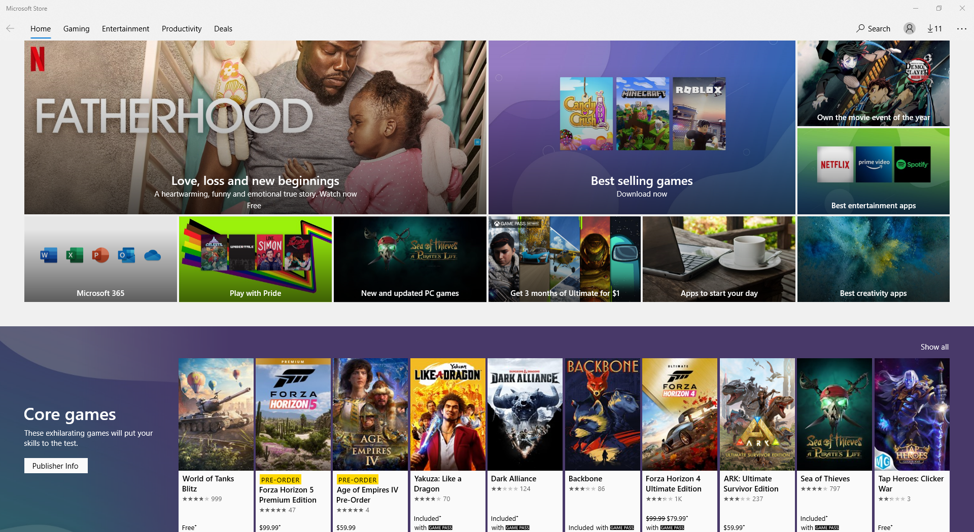
The Microsoft Store
Microsoft says it’s rebuilt its store to make it faster and to give it a new design.
More snaps for Windows Snap
Windows 11 also has a new UI for selecting which layout you want to snap to. We’ve been able to easily snap apps side by side since Windows 7, and Microsoft’s added additional layouts over time, but we haven’t seen a built-in windowing manager with this many options (Microsoft’s FancyZones was a separate download). The older suggestion system does appear to still be in Windows 11 as well.
:format(webp)/cdn.vox-cdn.com/uploads/chorus_asset/file/22679449/WIN_SnapAssist_Light_16x9_en_US_1_1024x576.png)
:format(webp)/cdn.vox-cdn.com/uploads/chorus_asset/file/22679454/2021_06_24_09_56_56_Window.png)
Modern icons
Microsoft is giving its icons some much-needed attention in Windows 11, finally overhauling some of the images that have been around since the ‘90s — though they might still include floppy disks. Microsoft shows off some of the new icons in the image below, but you can also find them throughout today’s videos and demos.
:format(webp)/cdn.vox-cdn.com/uploads/chorus_asset/file/22679568/Screen_Shot_2021_06_24_at_11.13.00_AM.png)
File Explorer
File Explorer’s top bar has also seemingly got some tweaks — the tabs appear to be gone, replaced by a row of buttons that appear to be more optimized for touch. The aforementioned new icons also add to the updated look.
:format(webp)/cdn.vox-cdn.com/uploads/chorus_asset/file/22679465/ZiM0K2r.png)
:format(webp)/cdn.vox-cdn.com/uploads/chorus_asset/file/22679556/2021_06_24_11_05_32_Downloads.png)
Tablet mode
Microsoft also showed off Windows 11’s touchscreen prowess — while Windows 10 did have a tablet mode, it’s now being deprecated in favor of a subtle transition to a full-screen experience, where your taskbar simply spreads out the icons a bit more, adds “subtle visual cues” and increases the sizes of touch targets to make windows easier to drag and tap.
:format(webp)/cdn.vox-cdn.com/uploads/chorus_asset/file/22679589/Screen_Shot_2021_06_24_at_11.14.00_AM.png)
You can see what the transition looks like for yourself at 3:47 in our video.
Microsoft Teams integration
Windows 11 will include Microsoft Teams, Microsoft’s communications app, right in your Start menu, and it’ll be integrated directly into Windows. Right-clicking the (redesigned) Teams icon in Windows 11 shows many more options than are available in Windows 10.
:format(webp)/cdn.vox-cdn.com/uploads/chorus_asset/file/22679500/WIN_Teams_Integration_16x9_en_US_1_1024x576.png)
:format(webp)/cdn.vox-cdn.com/uploads/chorus_asset/file/22679499/2021_06_24_09_52_41_Window.png)
Wallpapers
:no_upscale():format(webp)/cdn.vox-cdn.com/uploads/chorus_asset/file/22661987/windows11wallpapers.gif)
Microsoft has a collection of new wallpapers for Windows 11, with the default one looking like a glassy, fabric-y piece of coral. We have a whole post about the new wallpapers here.
The look and feel
Of course, there are changes that apply to the entire OS, not just parts of it. Transparency, especially when it comes to color, seems to be a heavy part of Windows 11, and Microsoft says it’s literally rounding out all the sharp edges in the UI. The OS also just has a more glassy, clean look overall.
There are, however, times where it’ll likely be hard to tell Windows 10 and 11 apart. I was able to recreate one of Microsoft’s screenshots, and while there are differences, it does show that app design is also a big part of user experience.


Related: